


Overview
Aviva India is an Indian life assurance company, and a joint venture between Aviva plc, a British assurance company, and Dabur Group, an Indian conglomerate.
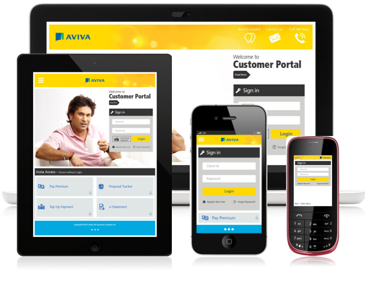
AVIVA customer portal provides self-service based customer tools for various tasks to manage the policies. The customer portal is accessible to the customers through AVIVA India website.
AVIVA customer portal provides self-service based customer tools for various tasks to manage the policies. The customer portal is accessible to the customers through AVIVA India website.
Challenge
In 2013, as per research data there was a significant rise in Indian customer base who were accessing customer portals mostly through various mobile devices but then the site was not optimized for mobile devices. In order to ensure AVIVA India was geared to serve the existing as well as build new customer base, while providing unparalleled end user experience through their digital channel, it was crucial that the digital touch points were optimized for cross platform devices.
Given Materials
Brand Collaterals & Demo access to existing portal
Solution Requirement
Redesign Aviva's customer portal while increasing the affordance of UI elements and make it responsive across all devices (including WAP browsers).
Final Design
SCOPE
Duration: 5 weeks
Role: I was responsible for managing stakeholder expectations, research, analysis, Information Architecture, UI design, navigational design, wireframing, prototyping and quality analysis.
Tools: Pencil, Paper, Adobe Illustrator, Adobe Photoshop, MS Powerpoint
Deliverables: UI style guides, High-fidelity screen mockups and interactive prototype
Understanding the Problem Space
The legacy design of the customer portal focused more on advertisement in form of a big banner on top whereas the bottom content kept changing on each page. It was less focused on primary tasks. The navigation was not well structured, there were no red routes properly highlighted in an intuitive way, and some important features remain hidden, which added to the difficulty of having a frictionless navigation for the users. The relevant information and tasks were not visible upfront to the users for which they had to resort to search. The search function was also not very helpful as the it was not even at the spotlight. Overall, the system didn't have a proper hierarchy of displaying information and CTA.
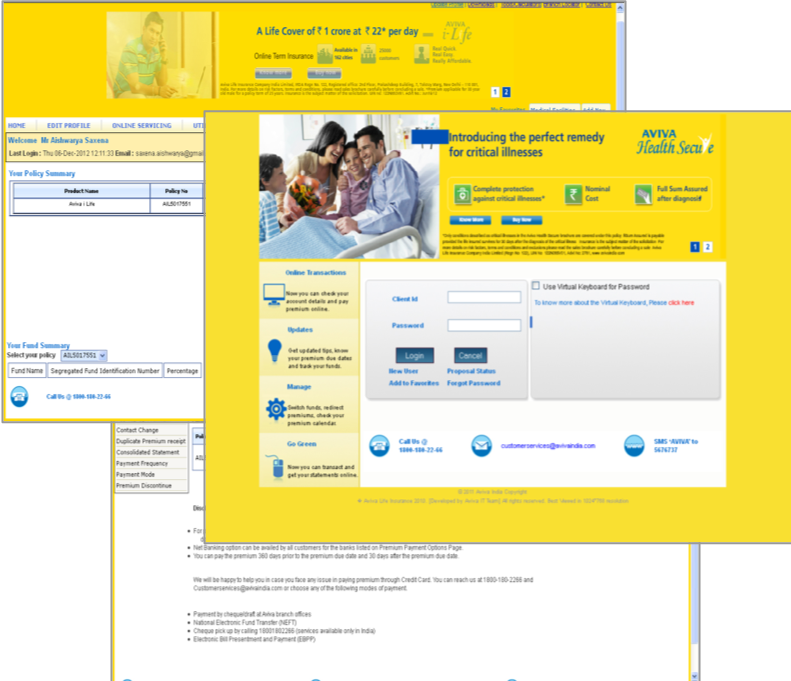
10 years old interface
METHODS
Content Auditing, Stakeholder Interview, Competitive and Comparative Analysis, Contextual Inquiry, Card Sorting, Wireframing, Rapid prototyping, and Usability Testing.
CONTENT AUDIT
The portal didn't have any pre-existing design documentation for which I needed to do a full content audit of the portal and plotted the existing user flow as a navigation map to analyse and find the red route. In order to do that, I had to use the portal myself and do couple of tests with existing customers.
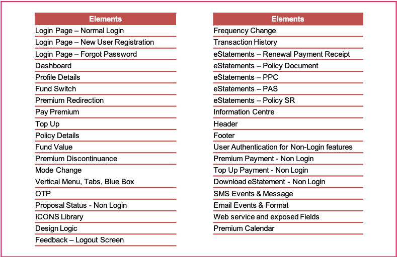
Content List
CONTEXTUAL INQUIRY
I conducted face-to-face as well as telephonic interviews with few AVIVA customers to understand their struggles while using the portal. It helped me in identifying the key task flows to focus on. It also gave me an idea of how they perceived usability of interface in comparison to other insurance providers.
CARD SORTING
I created paper cards and noted down the key tasks and features than ran couple of tests with few customers to understand which were most frequently used as well as which they considered most important to them. I took a sample size of 20 to get an acceptable level accuracy and plotted the graph as shown below.

NAVIGATION SYSTEM
The frequency vs importance graph helped me in identifying potential gaps in the user flow and allowed me to rectify the Information Architecture of the portal. I started by stripping away the old navigation system which was more like a spider-web and introduced a proper hierarchy to display information for ease of finding them as per frequency and importance of use. This formed a tree structure.
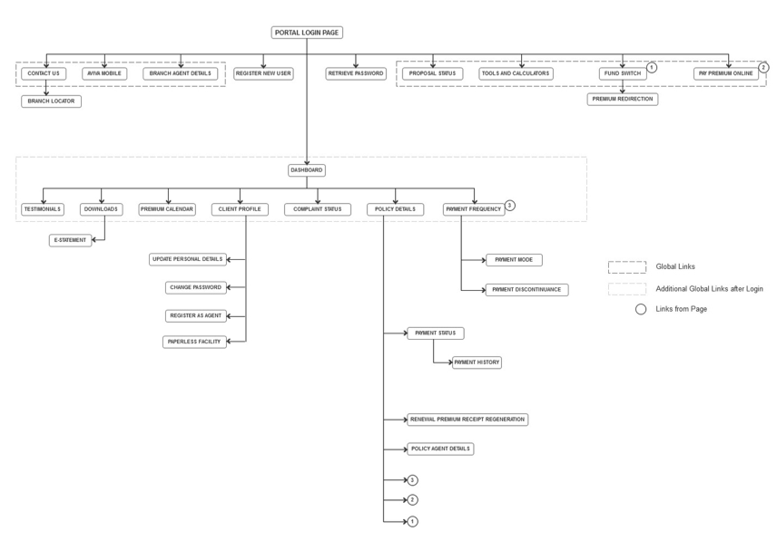
Navigation Map
WIREFRAMING
I started with few quick throw-away paper sketches then switched to Powerpoint for high-fidelity versions after I felt more confident with the layout.
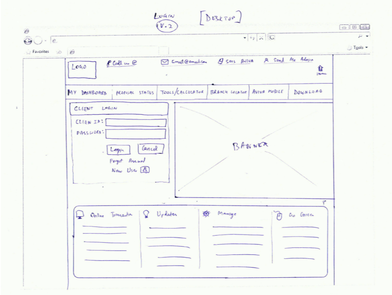
Sketches
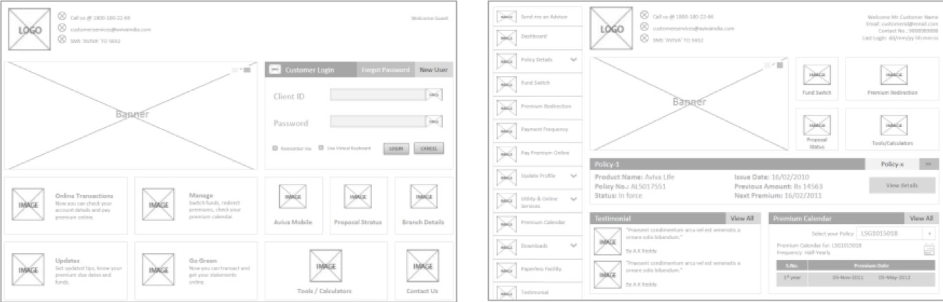
Wireframes
Rapid Prototyping and Usability Tests
After few iterations of wireframes I was confident to put in the brand colours and try prototyping the screens. I conducted back to back testing as I iterated the prototypes along side.
I conducted all the usability tests in the premises of the client office using printouts of high-fidelity screens I had designed using Adobe Photoshop. I reached out to the visiting customers and requested them to interact with the prototype that I was holding. At the end of each interaction, requested the individual to provide feedback on their experience of interaction.
The study shown that the earlier UI was too confusing to people and was cramped with too many things on a single page. So, I kept iterating and testing the new ones until I was confident. The testing with high-fidelity version helped in deciding on colours, icon sizes and font sizes.
The key areas I focused during those tests were customer's reaction to the colors in the interface, overall impression on the interface design, time taken to complete given tasks as per test scenario and last but not the least how they related the experience with other competitors.
The tests helped me to identify and eliminate 80% of the issues from my designs.
Defining the SOLUTION
With the redesign of AVIVA's portal, my main goal was to Accommodate the needs of users with different types of users:
For the busy professionals:
• Easy way to check information without worrying to login in any public place or unsecured network
• Do transactions without the need to login every time
• Easy way to check information without worrying to login in any public place or unsecured network
• Do transactions without the need to login every time
• Ability to access portal from any device
For the new customers:
• Improve information discovery
• Improve information discovery
• Reduce information overload
Iconography
Final UI elements
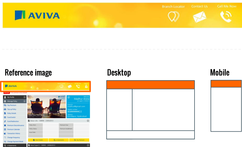
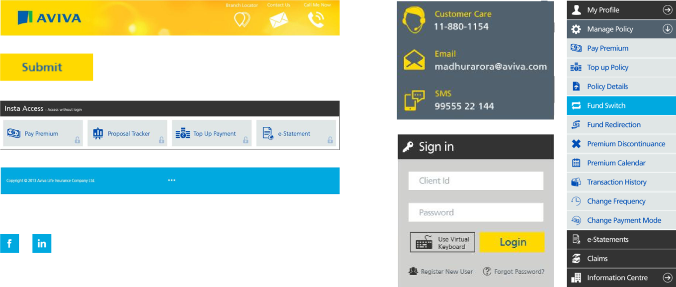
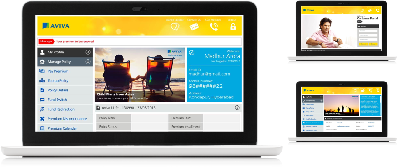
The entire design of the customer portal uses primarily yellow, blue & greys, while the color codes comprises with the brand guidelines document. The colour logics are partly derived from the brand guidelines for primary elements; such as header, call-for-actions etc. while for other elements, content and body, we ran few tests with customers to learn what is appealing eases the use. Shown above is the standard AVIVA header with sun beam and AVIVA yellow background color.
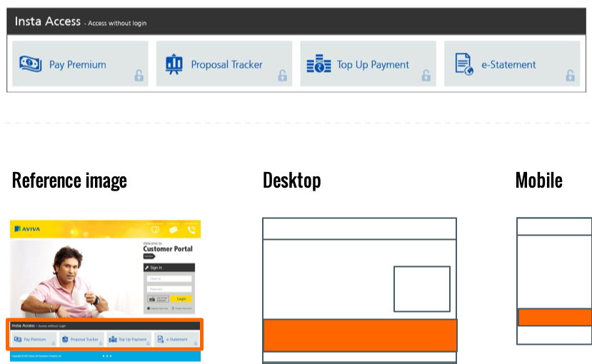
Insta Access, borrows the colors from the navigation menu. The high contrast ensures that it receives the required attention from the user.
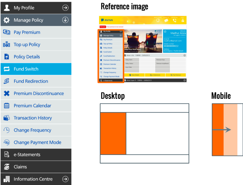
Navigation Menu, employs greys with high contrasts and blue as highlight color. The choice of white text over dark grey provides good readability and goes very well on tablets & mobiles while providing consistent experience across platforms.
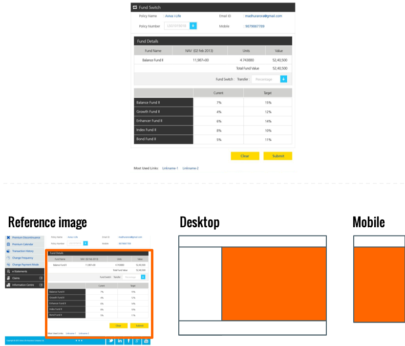
The body content is made with respect to the functional aspects. Greys being neutral and provide better readability. While blue is used sparingly for highlights and to create interest and break monotony. Standard “Blue on Yellow buttons” are used for action buttons as per the brand guidelines.
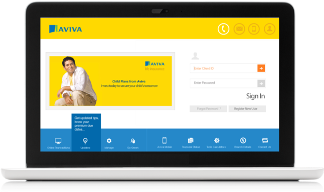
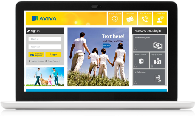
Desktop view
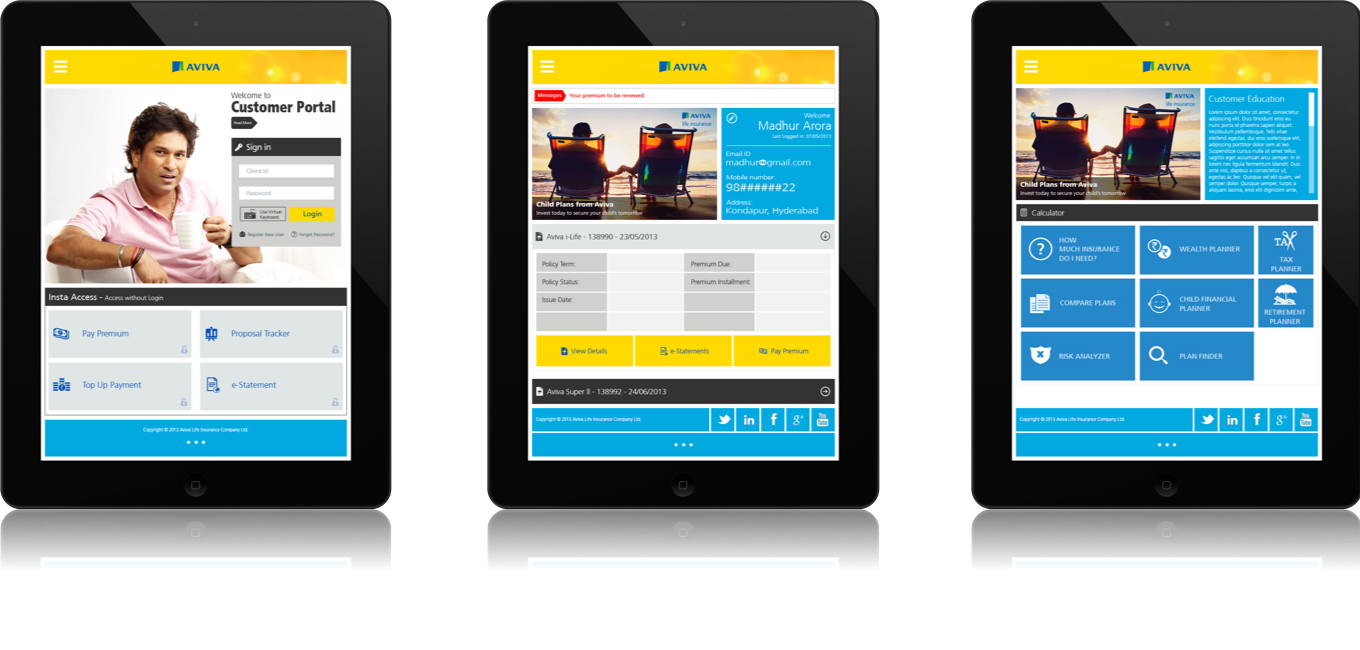
Tablet view
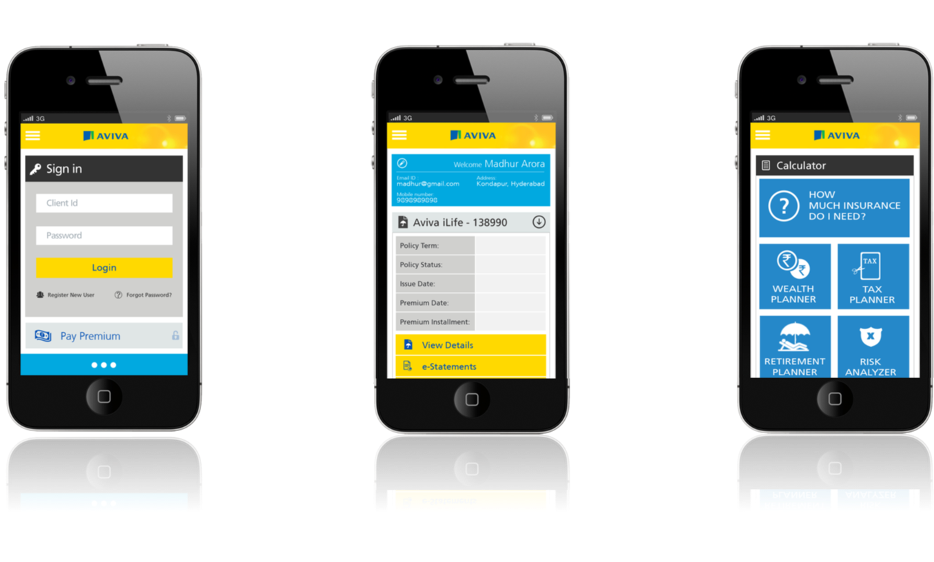
Mobile view
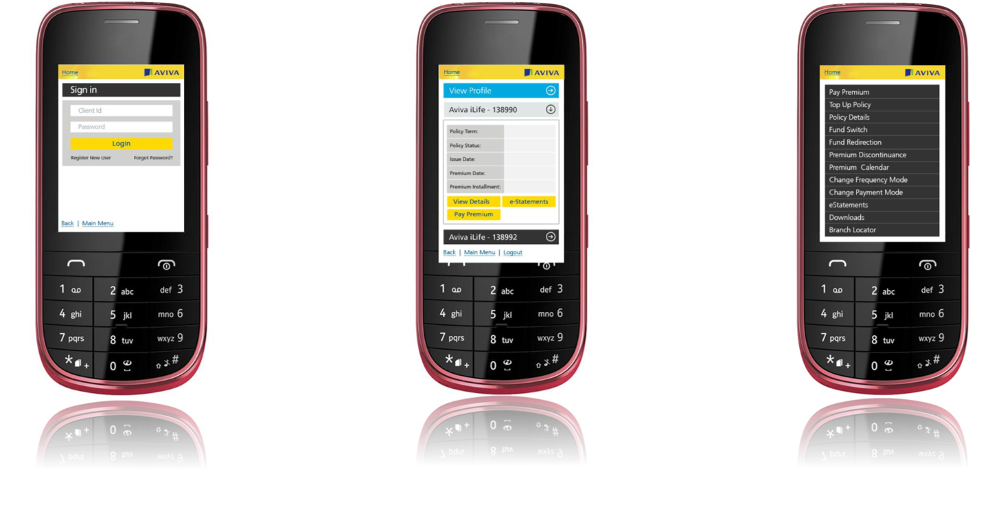
WAP browser view