

Introduction
It was in 2012, I had just skipped my admission for M.Des into IIT, to take up a job as UX Designer for this company. I had already decided to switch my career from Engineering to Design but this was about entering the industry, with no prior formal education, in that particular field. I was nervous as well as thrilled with the uncertainty crawling towards me.
Almost towards the third week after joining the company, I proposed my interest in redesigning the company's logo and convinced the stakeholder to do it in my extra hours.
During the early exploration, I discovered that there existed many iterations of logo prior to my attempt but none were ever finalised due to other client priorities. So, I had to know what didn't work and what I should do better to finalise the identity of the company.
Scope
Duration: The work was planned to be done as and when time permits not in the usual working hours. It took almost 6 months to finalise. I was working at the capacity of 1 to 2 hours a week.
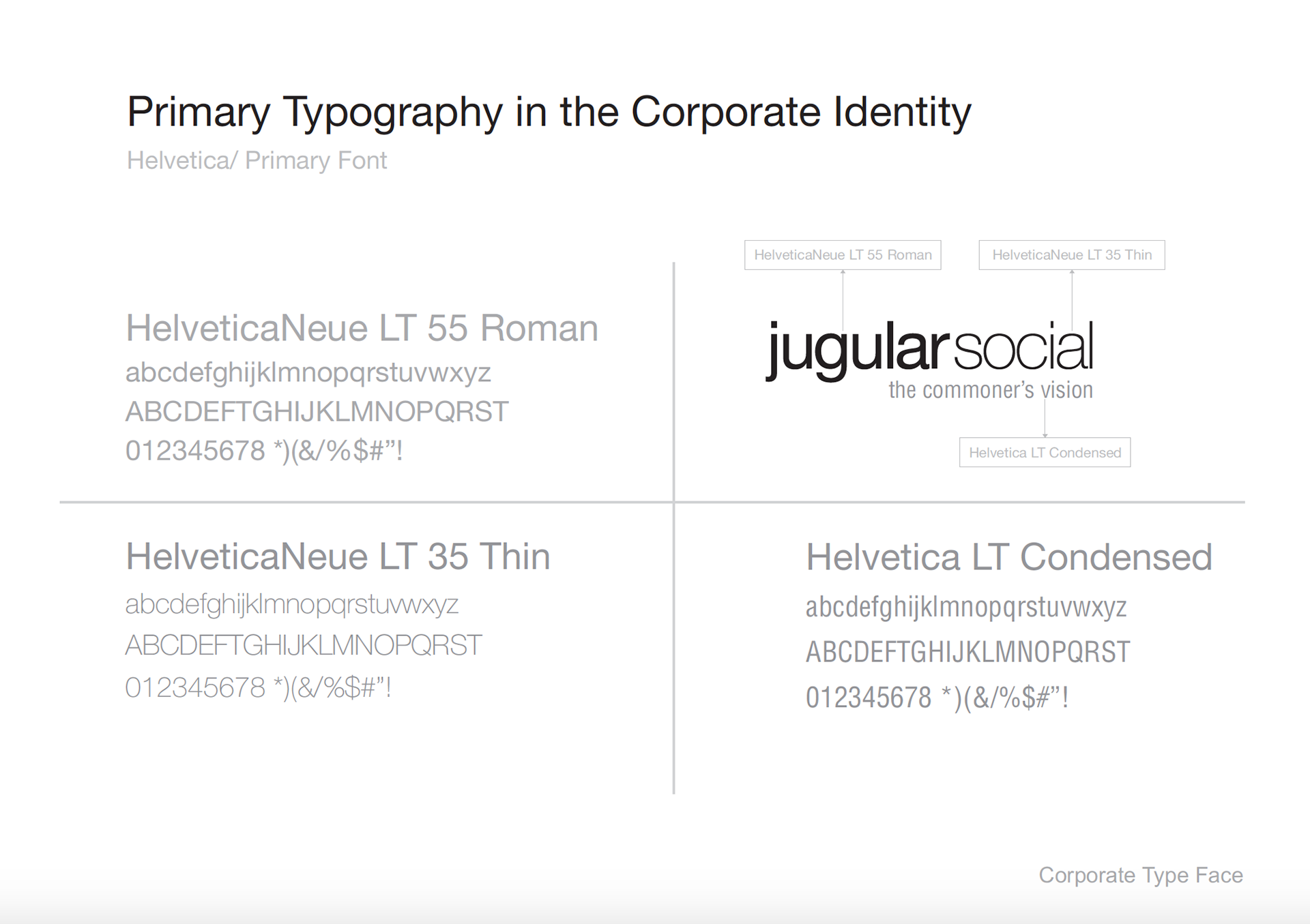
Skills: Graphics Design, Illustration, Sketching, Stakeholder Management, Branding Strategy, Typography, Business Research.
Tools: Paper, Pencil, Adobe Photoshop & Adobe Illustrator
Deliverables: Printable formats for office stationeries, Web formats for online medias
Challenges faced During early stages
Although the company was only 2 years old by then, but the founder had successfully established its identity in the market, as the one stop house, for all digital needs, of any brick-and-mortar business.
The key challenge was to communicate that identity through symbols and text while keeping in mind about the social factor that played the role as gears and wheels of the company.
Design Process
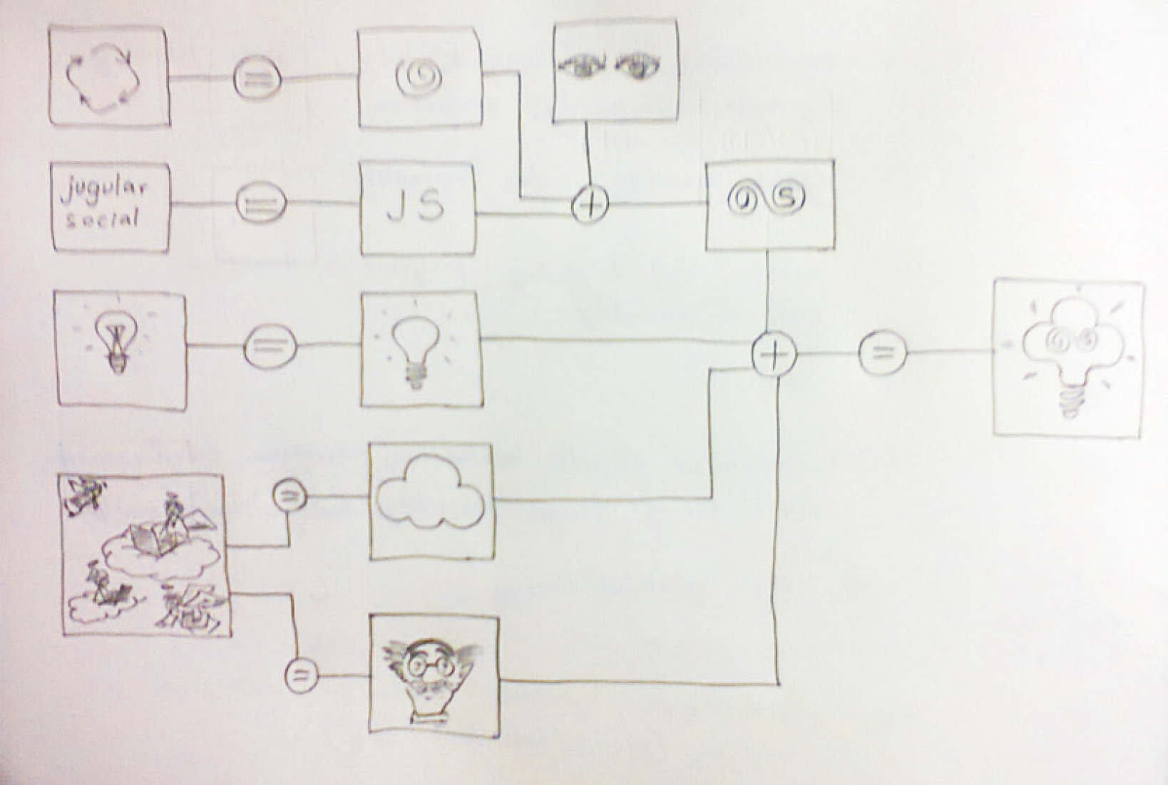
I took most of my time after work to educate myself about the distinction between bad and good design, while learning about the art of visual communication. I believed in learning through implementation so, applied my learnings in my design concurrently and used feedback loop with colleagues and stakeholders to iterate on ideas. Lunch hours and evening breaks were the best time for me to catch up with colleagues and occasionally with the founder to navigate my way through ideas of how organisation wanted to represent itself in front of clients. I explored the meanings of various forms, shapes and colours to prepare cocktails of visually rich graphics. Once, I was sure that I headed in the right direction and most were able to grasp what I intended to say through visuals then I took the doodles to render in tools like Photoshop and Illustrator.
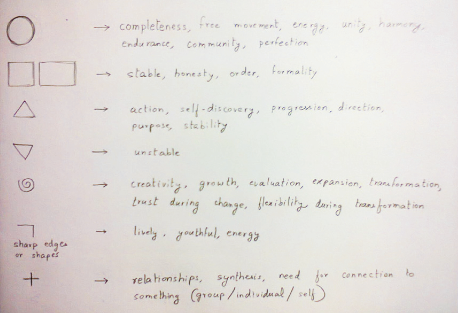
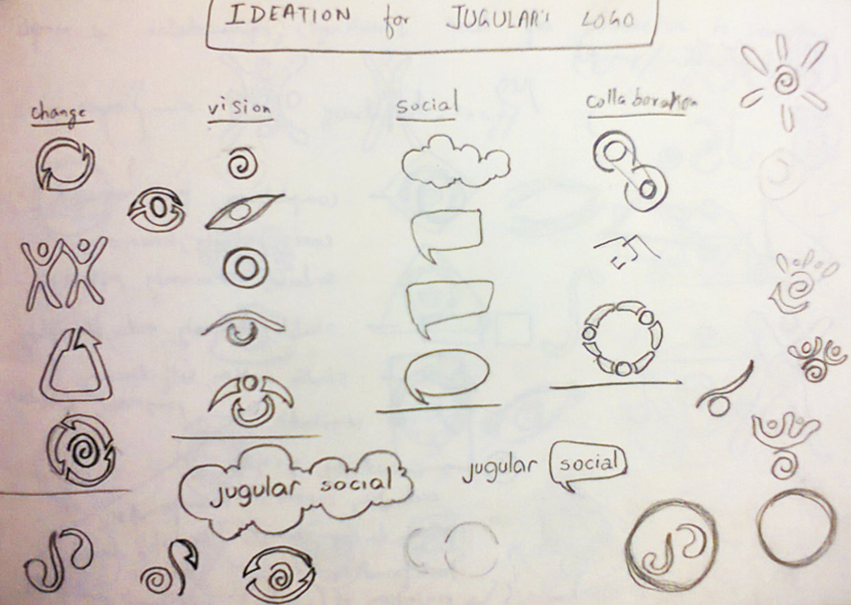
Initial research involved understanding the representation of forms and shapes. Later exploring the identified keywords representing various ideas that we wanted to communicate using visuals. Doodling various symbols that represented four key ideas those were change, vision, social and collaboration. Next step involved combining those symbols to form create more unified concepts. The steps were repeated each time the doodle didn't communicate the intended idea with clarity.
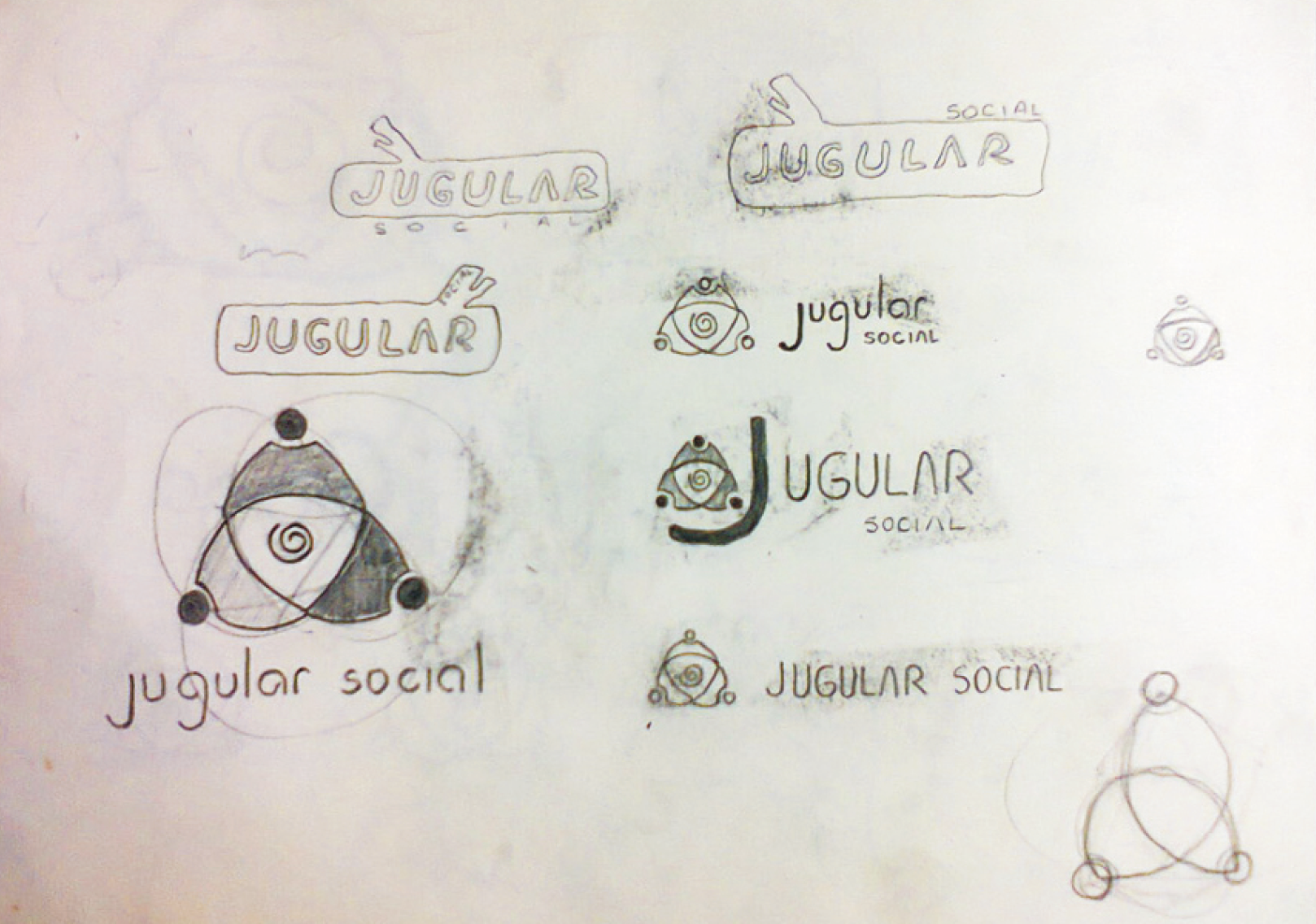
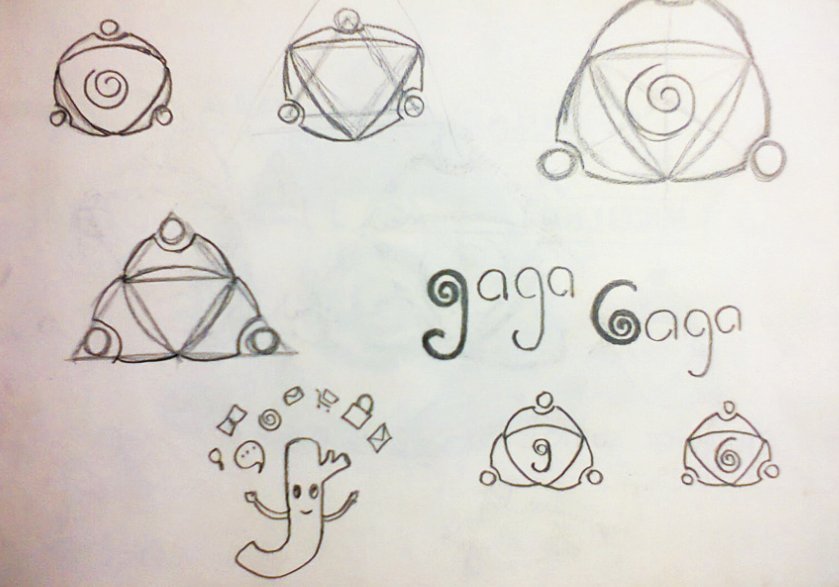
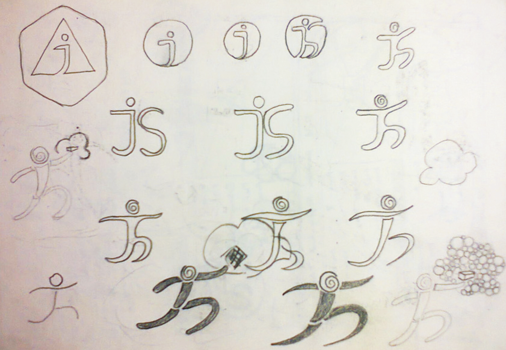
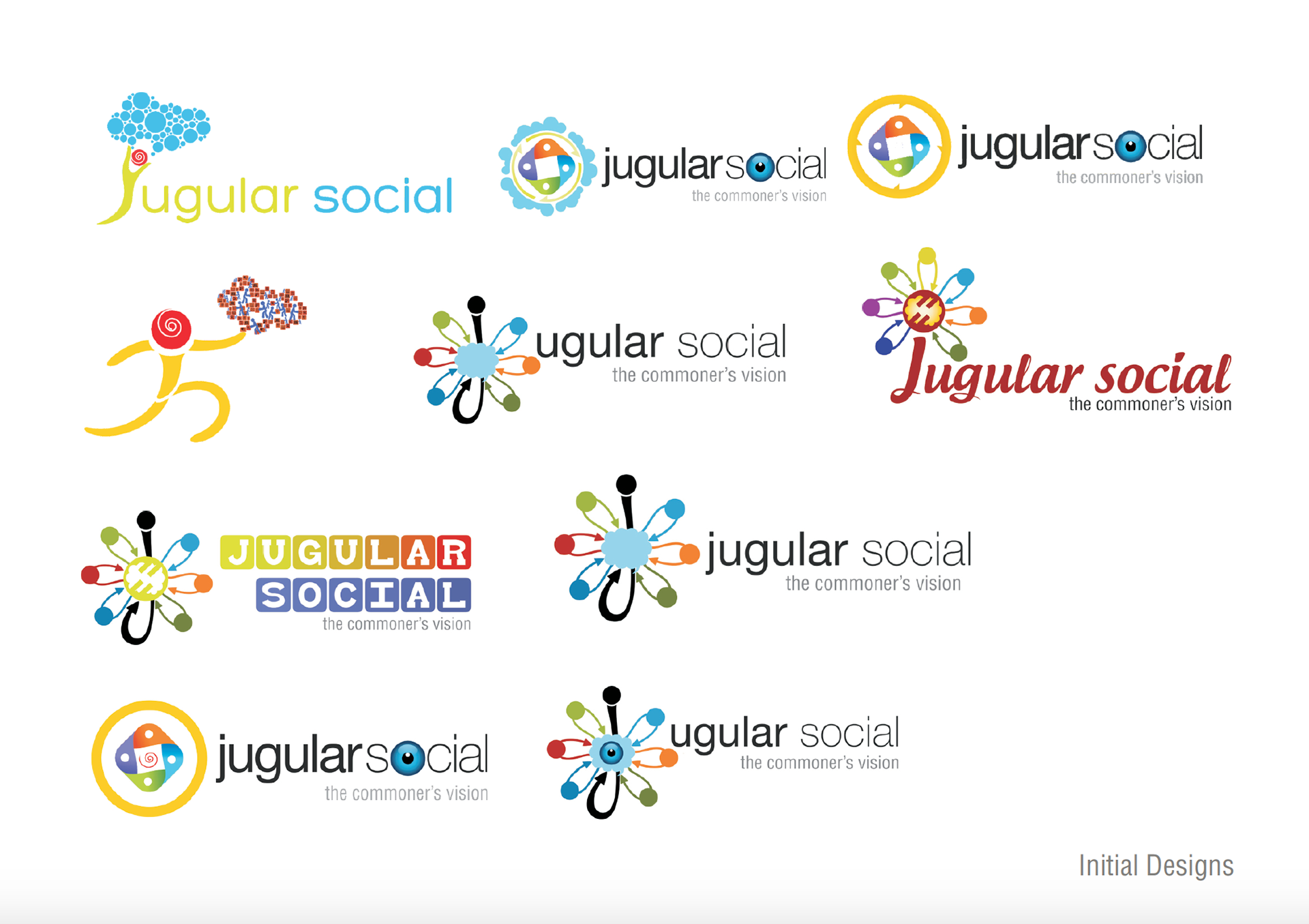
Many early doodles and designs were rejected. It helped in refining our ideas and know what we actually want to communicate our clients.
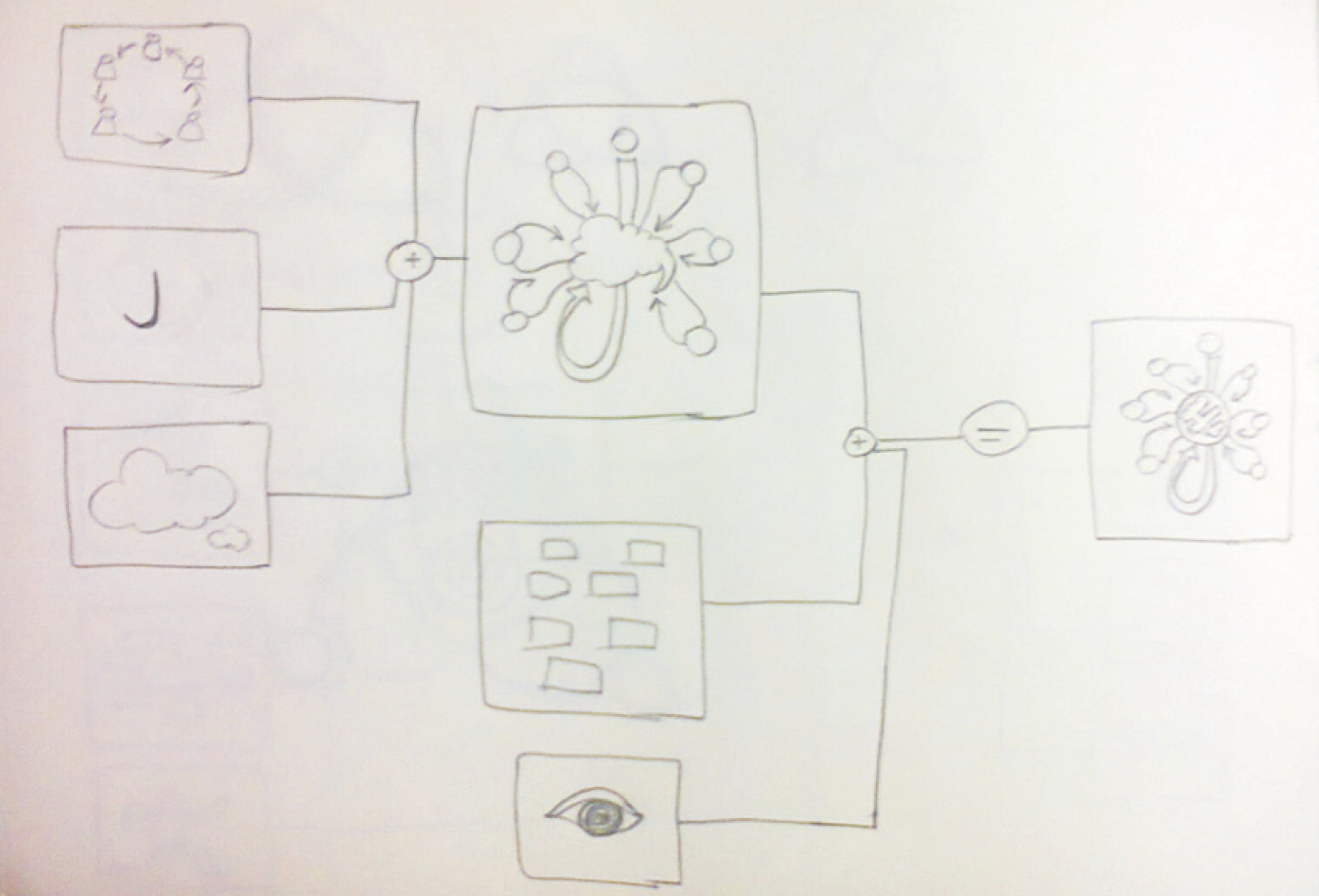
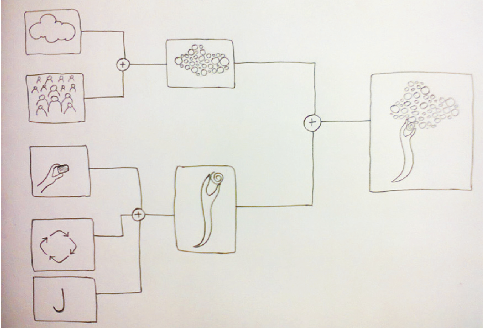
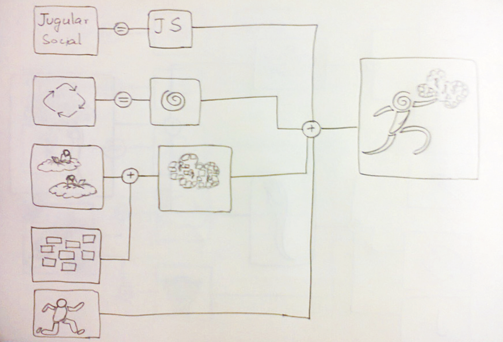
I discovered an interesting way of creating the designs. I took keywords and created different forms associated with them then mixed them to derive another form. This idea struck me while watching a person brewing tea and relating that sight with flow charts I use to create in my engineering days - as stupid as it might sound to some but being observant about the surrounding could teach us a lot. But still the problem was how to ensure others were able to understand what I was trying to show them. I shown hose forms and shapes to my peers, friends, strangers met during commute, and captured insights about how they interpreted them and then iterated.
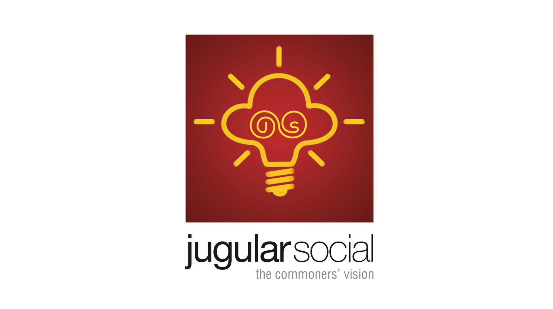
Final Design